
Here below shows me using photoshop in oder to lengthen the image to fit on my magazine. I copied parts of the background and pasted them above the image. Then using the paint tool and changing the opacity I shaded the colour blocks to blend in with each other to create the background as shown below.

Here below is an image of ideas of the masthead I created by using Indesign. At first I thought simple name like that of GQ hence the name M&M. However as progress preceded my magazine headed off in another style like that of NME. I then lengthened the name to what M&M stands for Music and More, however that name didn’t plan out too well either because it was too long for the magazine. Evidently I shortened it to More which suited my magazine and target audience more.

Here below is a mind map on the many ideas I had for my masthead fo my music magazine. I had many idea’s for the masthead of the magazine and all the names I used relate to the type of magazine. At first my magazine was going to be for people who liked pop music alone. However now my music magazine has evolved to including all different types of music much like the music Kerrang and NME have.

Here below are ideas for what I could use in my contents page. I’ve shown how it can be set out and I have also shown what can be seen on the contents page. These ideas helped me create my final outcome of my contents page.

 This is the original image before using photo shop to modify the image.
The image below shows how levels are used to brighten the image to give the participants in the image a more healthy glow. Comparing with the original image above you can immediately tell the difference. You can change the colour of the image by moving the level on three different colours, Red, Blue and Green. By evening up these colours you can create a healthy glow to each member within the image.ng with the original image above you can immediately tell the difference. You can change the colour of the image by moving the level on three different colours, Red, Blue and Green. By evening up these colours you can create a healthy glow to each member within the image.

The image below show the use of the Hue/Saturation. This helps increase the colour of the eye when your intensifying the colour.


Highlighted in the tool bar is the eraser tool. By using this you can change the colour of the eye. To do this you change the levels and Hue/Saturation as shown above. Then after moving that layer below the previous layer you use the eraser tool and colour in the eye. To do this effectively you have to change the brush size and the opacity to make sure that the colour comes gradually otherwise it wouldn’t give the effect wanted.

As told about above this tool bar below shows the opacity being changed in order to change the eye colour. This makes the colour come out gradually to make sure sure that when painted on it doesn’t come out uneven.

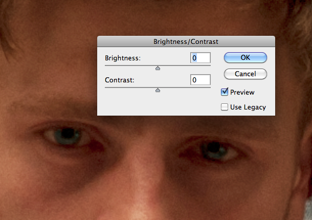
Here below shows the brightness and contrast used in order to increase the brightness of the eyes of the participants within the image. By doing this it helps bring out the eyes to capture the attention of the viewer.

 Before
After 
Here above is an example of what the clone stamp achieves when used. The clone stamp works by a cloning a piece of skin on one part of the body and they it paints over the top of a flaw in order to create perfect skin. It is mostly used for flaws such as wrinkles to create younger looking skin.

To the left highlighted in the tool bar is the spot healing brush. This is similar to the clone stamp but gets rid of flaws in a smaller scale. Its very much like a plaster in the way it conceals flaws such as spots. This is effective way to get rid of flaws such as spots in young teenagers without using the clone stamp because it is used on a smaller scale while on the other hand a clone stamp is more effectively used for older people such as Madonna because flaws such as wrinkles need to be covered.

Above is an example of the use of the quick selection tool. This can be found in the Photoshop tool bar as a brush with dotted lines around it. The black and white line that is surrounding the person in the image are also known as running ants. These running ants outline the object that the user wants to be cut out of the image to be pasted to another place. The running ants are easily adaptable to move is need be. If they have outlined some part of the photo that the user doesn’t want simply by pressing the alt key the user is able to move the running ants.


These two screen shots show examples of cropping the image. As seen below your able to see some black background that was not meant to be there. However using the crop tool that is found in the toolbar. This neatens up the photo to make it look more professional.

The images i have chosen for my music magazine are circled about in red. The reason I chose these specific images are as followed.
The top image was chosen due to Shot distance and Framing. The image was taken at a long shot in order to capture all members of the band within the image. By using long shot I was able to capture the emotion of each band member and it shows clearly how seriously each band member takes on their role within the band. Also relating to mise en scene their cloths depicts what each member of the band is like and it shows their individuality. The framing of the band also shows the importance of each member. Another way it shows this is the colour within the image. The lead singer is highlighted within the image by contrasting against the other members, the colour of his shirt being the main highlight. By the light brown contrasting against the dark black and green it shows clearly to the target audience that the member of the band is important in some way. The lighting within the image gives off a sense of mystery to the band capturing the audiences attention drawing them into the image wanting to know more about the band.
The middle image also depicts the individuality of each member within the band, however the framing of having the band members close together shows that though they are different individually their differences bring them together to create this band. Again the image is a long shot in order to show each member of the band within the picture. The lighting within the image shows each member of the band clearly so the target audience can see who each member is. This then draws them in wanting to know more about each member. All members of the band are highlighted with light to show that they are all equal as a band.
I chose the bottem image because it shows each individual member of the group and depicts each members personality. By making them stare off in different directions it shows the audience the intensity of the group of the individual preference of each member by the proximity of each member shows easily that they have come togther to create this group.
My target audience will be for men aged between 15-25 that are interested in music artists such as the Black Eyed Peas and Dev. Below shows a picture of what my target audience may look like. As a typical teenager he spends most of his days listening to indie, rock and R’n’B music. If he’s not listening to his music he plays his Xbox or PS3. He likes to listen to motivating music while working out in the gym and as a rugby player he must exercise regularly to keep fit and the music he listens to helps with that motivation.
He loves reading music magazines to connect with his secret love of all music. The magazines helps build his intellect of the newest bands and records. He loves to go out dancing but also listens to music to determine his moods.
Like all stereotypical teenagers my target audience revolves his life around music and would most probably say that he couldn’t live without it.


