NME

Above is the front cover for NME magazine. The masthead is found at the top left hand corner where you would normally find the masthead. It is easily recognisable by the masthead being bright and bold in the same font that its usually in. Its bright pink font co-exists with the main cover line and the other cover lines to keep with the three dominant colours of the cover line which are pink, white and black. There is only two types of font situated on the front cover and that’s to differentiate the cover lines from the anchorage.
The dateline is found above the masthead and the selling line is found beside it. These two are dramatically smaller than the writing around it because they are not the most important parts of the front cover however your eye get instinctively drawn to it by being so close to the masthead. The eye automatically goes to the main cover line and the masthead then it finally wonders around the masthead showing the dateline and the selling line.
This is a special addition magazine and it easily shows that no only by saying it as the selling line but also because its slightly different from the original set of its previous magazines. However like the original magazines the main cover image is found in the center of the front cover and its usually about the main article within the magazine. The main cover image is one that’s been taken in a studio making it look more professional.
This is the contents page of NME magazine above and as seen it carries on the colour scheme of pink, white and black like that on the front cover. It also uses the same font but however considerably smaller. The masthead can be found in the opposite corner of where its placed on the front cover back to its original colour on other issues of red.
Again the contents page is considerably different from the front cover that rather than being simple with just one photo it has lots if images to catch the viewers eye. The headlines are easily seen by the viewer by having the largest font than the rest of the text and also the page numbers of the articles are bigger than the text showing that those are the headlines. The puff that is used also carries on the colour scheme by being pink and also its has big font in order to catch the viewers attention.
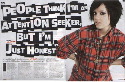
The headline reflects the person who the article is about. The headline screams at the viewer ‘wild’ which how Lily Allen is made to look. The headline is big and bold easily readable and catches the viewers eyes instantaneously. The main image dominates the the double page spread leaving little writing for the article. The main image is a shot taken from within a studio rather than location making the piece look more tidy and professional This almost entices the reader without getting bored because no one wants just writing which is boring.
The colour of the font for the article compliments with what Allen is wearing which is red, white and black. These colours are also traditional colours that magazines use and happens to be the house colour of the NME masthead which is red.
KERRANG
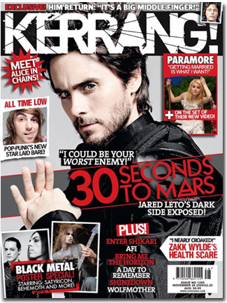
The front cover of Kerrang is considerably different compared to NME. The layout is instantly recognisable to all Kerrang fans because of its busy and cluttered layout. The masthead is at the very top of the front cover with its font that is regogniable to anyone. Its also the biggest text on the page showing that its the masthead. The main cover line is situated basically in the middle of the front cover while the rest of the cover lines are placed around the main cover line. The front cover is in the traditional colour of red, white and black. The font of the cover lines are all the same font just different sizes from the anchorage except the masthead which is a completely different font from all of it to make it stand out.
The selling line is placed above the masthead in a smaller font than the cover lines because its not as important than the other texts on the page. All the cover lines are placed with images promoting their articles and showing the viewer who the article is about. However these images are a lot smaller than the main cover image which is found like that of NME basically in the middle of the front cover. This image like that of NME is taken within a studio rather than location. Though the cover lines and other images above the main cover image it is still easily seen that the image is about the most important article within the magazine.
Above is one of Kerrang’s contents page. Very much like its front cover the layout is clustered and uses various images to promote the headlines within the article. These images vary from taken on set or taken on location.
The font carries on from the front cover to the contents but size and colour changes. In the contents page the text is smaller than that on the front cover in order to fit more headlines and images on the page. Also to make the headlines, page numbers and the masthead ‘contents’ stand out instead of using red yellow which is a much brighter colour is used to make it all stand out more for the viewer.
Also the editors message is in the top left hand corner where the masthead is found on the front cover. This shows that it is important and where the viewers eye automatically goes. All the headlines are placed on the right hand side which is unusual for readers because normally writing goes left to right. This intrigues the viewer and shows that the magazine is in its own style and makes it recognisable to the Kerrang fans then.
This double page spread shows that the main image dominates the double page spread, however instead of just having one giant image it has one big image and a few small ones. All the images have been taken in a location so the band hadn’t been posing for these images making them look more natural and relaxed. All the images are in black and white which highlights the writing a bit more also it gives the images more definition and a sense of reality rather than the fake persona you receive when the image has been taken in a studio.
The text on the double page spread has the same font as the house font which is also found on the front cover and the contents page. The headline is also bigger than the rest of the text to easily show that its the headline of what the article is about. Also it also keeps with the house colour which is red, white and black. A drop cap is used to start the article. By using a drop cap it catches the readers attention automatically drawing the eye to the beginning of the article.


